
Post #3

After looking at popular teen magazines I decided to look at popular environmental magazines to help incorporate both genres into my magazine cover's edition. Here are some covers I found...
Image result for Down to Earth (magazine)Image result for Resurgence & Ecologist
Image result for Greenpeace Magazin
Image result for environmental magazines climate change
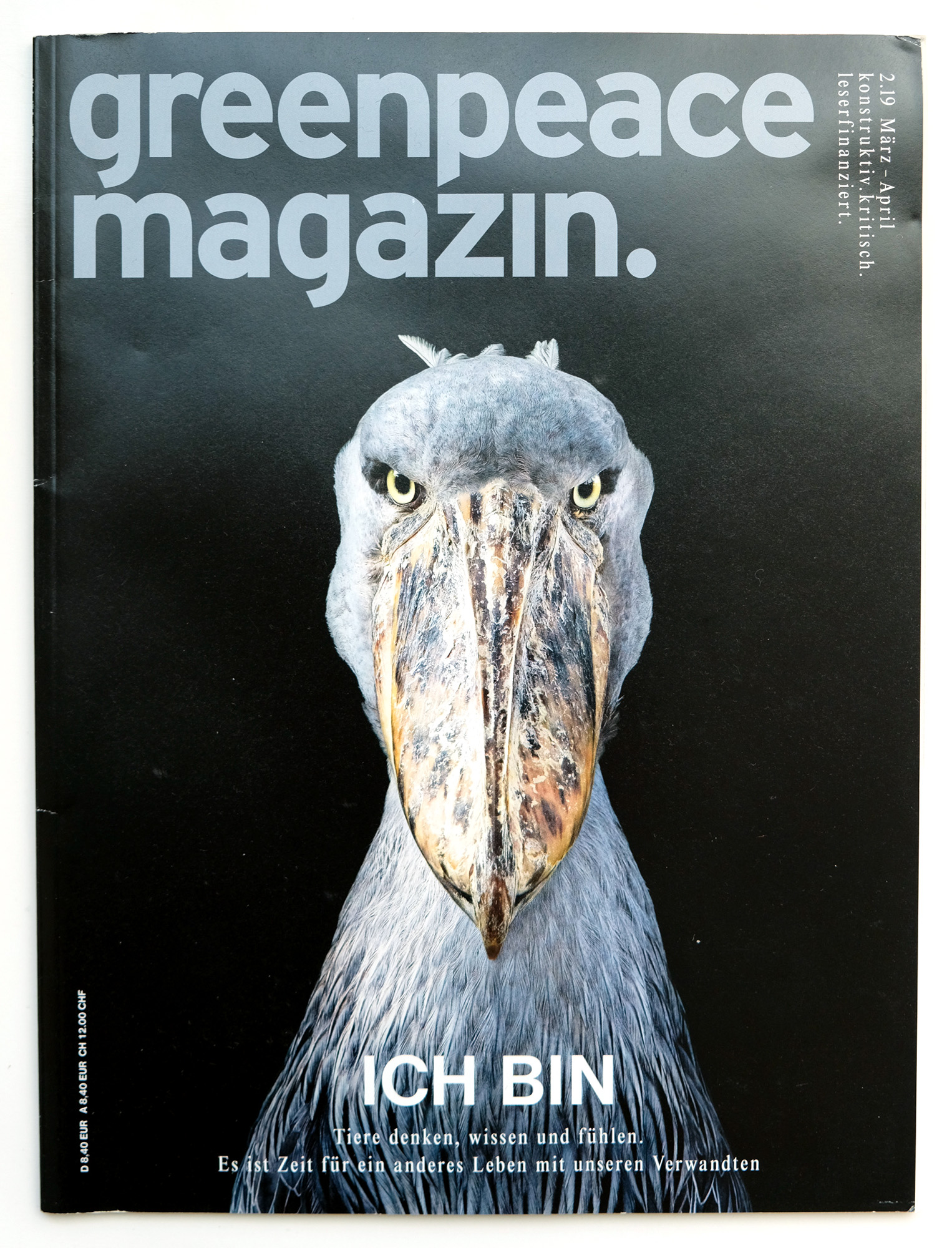
One common theme among environmental magazines talking specifically about environmental issues is that the anchorage is often really intense. The model is often staring at or away the reader with a serious, almost concerning look on their face. The model's expression often ties into the headline and strap line to deliver the idea that the content it very serious and dangerous. The colors that are used the most in the magazines i saw were green, blue and red. The greens and blues often represent the colors of the environment, and the reds are used to grab the readers attention in puffs, masthead, and headlines and to represent danger.


Comments

Popular posts from this blog

Post #26

Today I will be writing my article... One of the biggest ways teens keep up with the hottest trends is through fashion. Celebrities such as Kanye West and the Kardashians have sparked up trend after trend, which has caused a huge demand for popular clothing stores to keep up with. Although clothing companies have been doing a good job at supplying the demands from teens, a lot of people don't know that they are actually hurting the environment by buying from these mainstream companies. I spoke with a friend of mine about this issue to test how educated she was on this terrible trend called... fast fashion. SO WHAT EXACTLY IS FAST FASHION? "...Fast Fashion is the process of clothes being mass-produced... trends go in and out and the clothes that aren't sold are put into landfills", According to Alexa. She is right. Fast Fashion is the term used to describe clothing that is produced on a massive scale to reach demands from consumers, including teens. These clothin...

Post #29

The final part of the final part of creating this magazine was to put together the fourth page. I decided to put my article title at the top of my page in the font Abril Fatface because the same font was used to describe the same article in the headline on the magazine cover. To add a little pop of color, I went along with the same idea used on my third page and put the title over a green rectangle for contrast. For my article text, I decided to divide the text into two columns with a divider in between them, as three or more would leave little space for even a couple of words. The font I used for the text was Kollektif because it matches the text I used in the table of contents. I keep trying to use the same group of fonts so that my magazine does not look all over the place. When placing the article text from my previous blog into my article on Canva, I encountered something I was expecting, my article was too long. I first decided to remove the section in the article about Nike...