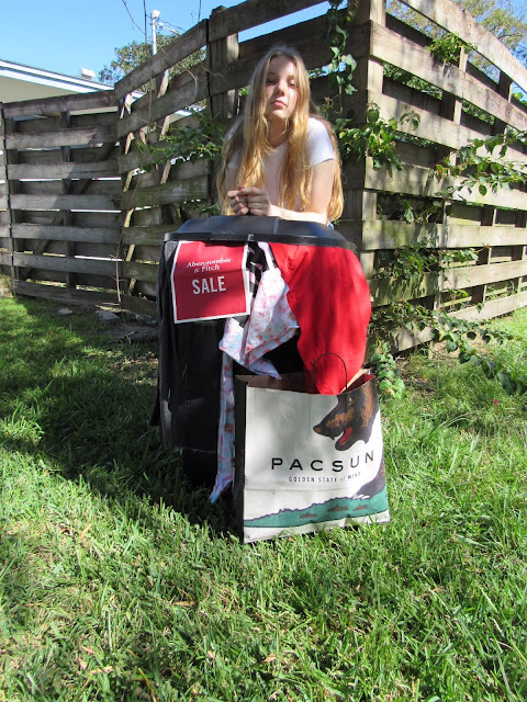
Because I needed to look for a new photo, I referred back to one of my previous blog posts where I talked about my favorite photos from the photo shoot. However, when viewing them I realized that all of the photos shared the same problem; they lacked space. I realized than since my shot of the model was too close up, I did not have enough space in the margins and bottom to put my puffs and headline/strapline. In some photos, one side of the margin had enough room, but the other side had barely any. Because of this issue, I had to go deep into my recently deleted to find my other photos from the photo shoot. One of the only photo I could find with enough room on the sides and bottom was this:
I chose this photo primarily because of the space in the margins and on the bottom, but I also loved how much light there was in this photos compared to the others. Since the shadowing is only on the upper side of the cover, it leaves enough light on the bottom to put my black headline and strapline without it being hard to read. Additionally, the white and pink shirt in this photo clearly shows that it has been made by Victoria's Secret PINK, a popular teen fashion company that uses fast fashion, while the logo was hidden in the other photo I originally planned on using. At first, I was really upset about my intended magazine cover photo not working out. I almost decided to go out and have a whole new photo shoot. However, I calmed myself down and realized that it would not only have been a hassle to do so, but both my model and I took a lot of time and effort into these photo shoots, and that I should consider looking back at my photos. Now I am glad I switched my cover photo, even if the old one had enough space in the margins and no shade on the bottom. I feel like this photo seems more bright and happier in general, which will help attract more teens to my magazine. I also feel that the shade on the top helps bring more attention to the bottom, which is where my headline and strap line will be.

Comments
Post a Comment