
Post #21


Above are some of the pictures I took today. When doing this photo shoot, I wanted to experiment a little with the lighting. I first tried to shoot photos with my model facing away from the sun to see how it would look. The results turned out better than I thought; the audience could be able to clearly see the H&M logo and the background looked beautiful. However, the model's face was not visible, and I wanted to get his serious facial expression visible. Without it, the audience may get the misleading message that the article is about the good side of H&M due to the beautiful background.

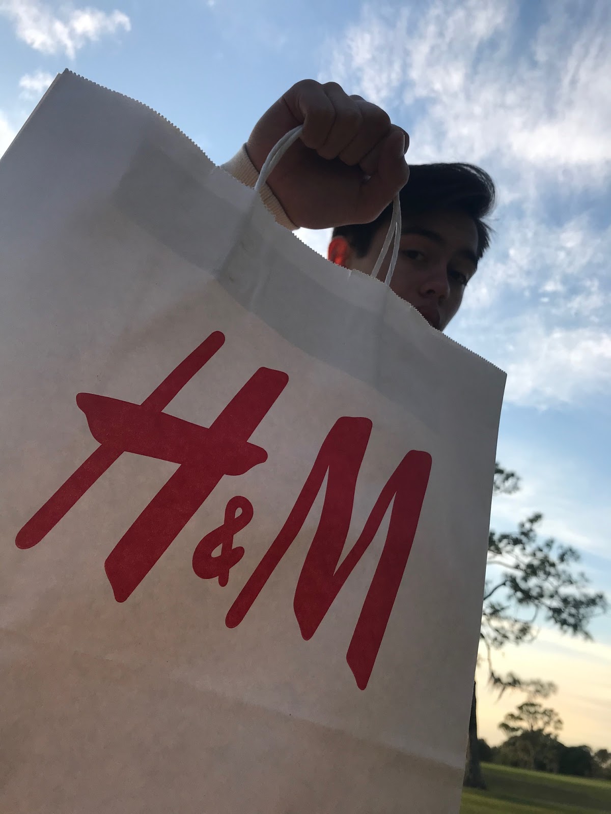
 The next set of photos were taken with the model facing the sunset. The pictures turned out good too; the H&M logo was visible (obviously) and I was still able to incorporate some sort of element of nature in my photo (the trees), which goes along with my theme of the environment in my magazine. Out of the three bottom photos, I decided to choose the last one because my model looked the most serious in it. Additionally, it would fit the best in my table of contents because the photo has the least distance between the top of my model's head to the bottom of the H&M logo on the bag, leaving more room for my table of contents and therefore making my magazine look cleaner. 

After selecting my photo, the last thing I had to do for my table of contents was to caption the photo. When making a caption for the photo, I needed to keep in mind what my article would be about. Since it is called "Here's Why H&M is #Cancelled", it would probably be safe to assume it's about H&M's harmful business practices. I decided to look up information about H&M's environmental impact, and using the source goodonyou.eco, I found a report that talks about how H&M impacts people, animals, and the planet. I specifically found information about H&M using harmful chemicals in their clothing and treating their workers badly by both not paying them enough and using child labor. I chose to use this information in my caption to shock the audience and make them want to know more about what one of the most popular clothing brands is doing wrong. The caption I came up with is "How H&M is linked to child labor and pollution!" 

Now that I have my caption done, I am officially finished with my table of contents. Here is what the finished product looks like:


Comments

Popular posts from this blog

Post #3

After looking at popular teen magazines I decided to look at popular environmental magazines to help incorporate both genres into my magazine cover's edition. Here are some covers I found... One common theme among environmental magazines talking specifically about environmental issues is that the anchorage is often really intense. The model is often staring at or away the reader with a serious, almost concerning look on their face. The model's expression often ties into the headline and strap line to deliver the idea that the content it very serious and dangerous. The colors that are used the most in the magazines i saw were green, blue and red. The greens and blues often represent the colors of the environment, and the reds are used to grab the readers attention in puffs, masthead, and headlines and to represent danger.

Post #26

Today I will be writing my article... One of the biggest ways teens keep up with the hottest trends is through fashion. Celebrities such as Kanye West and the Kardashians have sparked up trend after trend, which has caused a huge demand for popular clothing stores to keep up with. Although clothing companies have been doing a good job at supplying the demands from teens, a lot of people don't know that they are actually hurting the environment by buying from these mainstream companies. I spoke with a friend of mine about this issue to test how educated she was on this terrible trend called... fast fashion. SO WHAT EXACTLY IS FAST FASHION? "...Fast Fashion is the process of clothes being mass-produced... trends go in and out and the clothes that aren't sold are put into landfills", According to Alexa. She is right. Fast Fashion is the term used to describe clothing that is produced on a massive scale to reach demands from consumers, including teens. These clothin...

Post #29

The final part of the final part of creating this magazine was to put together the fourth page. I decided to put my article title at the top of my page in the font Abril Fatface because the same font was used to describe the same article in the headline on the magazine cover. To add a little pop of color, I went along with the same idea used on my third page and put the title over a green rectangle for contrast. For my article text, I decided to divide the text into two columns with a divider in between them, as three or more would leave little space for even a couple of words. The font I used for the text was Kollektif because it matches the text I used in the table of contents. I keep trying to use the same group of fonts so that my magazine does not look all over the place. When placing the article text from my previous blog into my article on Canva, I encountered something I was expecting, my article was too long. I first decided to remove the section in the article about Nike...